Intro
Vyatta announced that their new web GUI is available for their Vyatta OFR.
See the announce here:
http://www.vyatta.org/forum/viewtopic.php?t=1572
http://www.vyatta.org/forum/viewtopic.php?t=1573
As said there, this is the phase I of the GUI, so don’t be disappointed if you think something is missing from this version or it may not look, feel or move the way you would like. More is to come from your favorite router vendor.
Vyatta’s rival, Cisco made available last year a new GUI for their IOS Software based access routers, called Cisco Configuration Professional. Some Cisco routers are actually shipped with the Cisco Configuration Professional (the Cisco Configuration Professional Express is also embedded in the flash of the router).
Coming back to Vyatta’s OFR new web GUI, the first impressions are indeed very pleasant. The interface is slick, clean and in general fast, and why not to say it, it’s looking cool. :)
Some fear about web GUIs because they may be slow, but this is not the case of Vyatta’s GUI, as it’s pretty fast.
Sometimes is intuitive, sometimes is not, sometimes it feels like a true GUI, sometimes it’s room for improvement, sometimes it is easy to use, sometimes not, some things are easier to configure than others. There are some fine and crafted spots but also some rough spots. But all these may vary from person to person to be honest.
The trick is to look at it from different points of view:
- the users familiar with Vyatta OFR and its CLI: will likely feel like the fishes in the water(in case they liked the CLI, which may be quite true). The structure and layout of the GUI will allow them to quickly feel like home with the GUI, and easily navigate through it. But the question is: do they like to use the CLI day-by-day, or rather they prefer to use the GUI with regularity, or maybe mix them to take advantage of both, or maybe they want to migrate from using the CLI to using the GUI. A different need and desire will result in a different expectation.
- the new Vyatta OFR users(who can be further split in different categories: Linux users, Windows users, having a background with Cisco gear or other vendor, or perhaps people less technical …, thus a multitude of persons having certain habits): normally, like in the case of working with a new product from a new vendor, there will be a quick or longer period of accommodation(varying from person to person), either we’re talking about configuring Vyatta from the CLI or using the GUI. As already said above, the GUI may be sometimes intuitive, and sometimes not. There are hints designed to help people understanding what they have to do or to enter in various boxes, sometimes the hints are clear and precise and sometimes so-so. And there isn’t any Help button or so within the GUI to provide further info, so the users will have to consult the documentation(in case they didn't do that already). The new users might want to use the CLI day-by-day, or use the GUI with regularity, or use both of them very often, or they might start with the GUI with a desire to later migrate to the CLI. Due to the structure and layout of the GUI it may be easy for these new users to go from the GUI to the CLI.
Let’s take a look at it. Since there are many options within this GUI, I can’t cover all with these blog entries.
First Look
The GUI is enabled from the CLI with the set services https command followed by the commit command. See Vyatta’s documentation, the Quick Start Guide for more details.
For the moment this a direct “global” command, we cannot specify on which interface and/or on which IP address the GUI will listen for connections-define management interfaces-, and which hosts are allowed to manage the Vyatta OFR machine using the GUI. But this aspect is easily addressable by using simple firewall rules.
Since Beta 3 is being released as package updates only, I don’t know if the final version(don’t think though), for example will include a wizard or something after/during install or directly from live CD after login, so that people will run this wizard and setup an interface for management and enable the GUI, without having to use the CLI to enable the GUI.
As expected, for security reasons, the GUI uses HTTPS and not HTTP.
For the moment Vyatta recommends us to use Firefox 3 for a better experience with the GUI, IE 7 is also supported. And Vyatta tells us that the browser compatibility list will be improved over the time.
I’ve noticed some funny screens on a machine with Firefox 3.0.3, see bellow. I’ve updated to Firefox 3.0.6, and no longer saw them. Interesting with IE 7 I did not notice them at all.
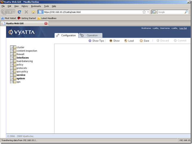
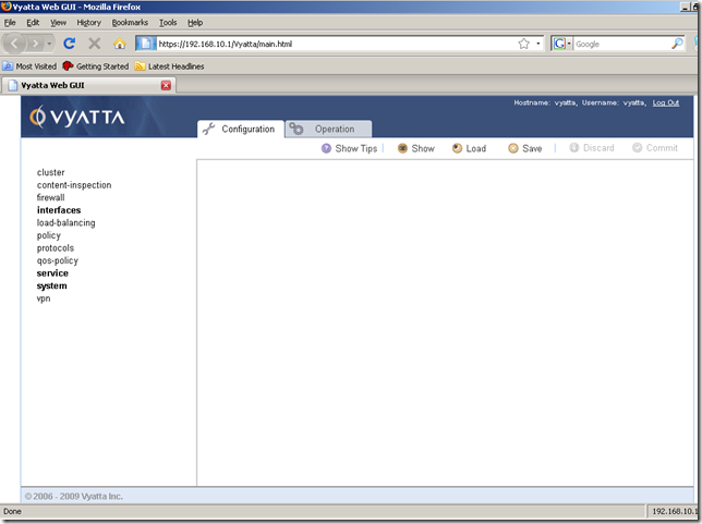
Let’s start Firefox 3 and connect.
As expected, Firefox warns us about the self-signed certificate:
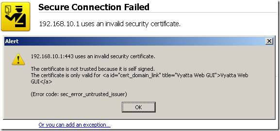
We can add an exception to continue.
And here it is, the login screen, looking pretty:
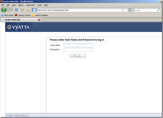
As expected, we cannot login with the root account(we cannot do that by default with ssh too):
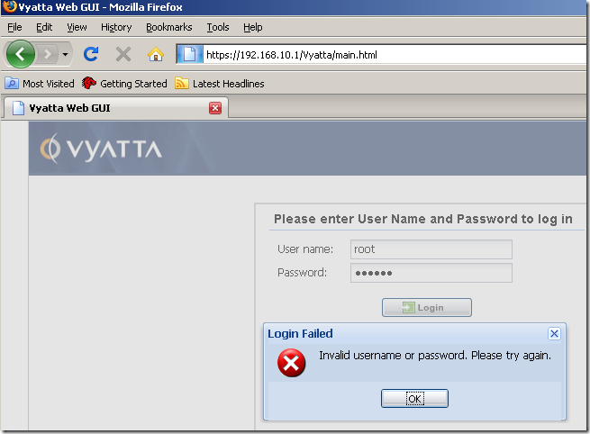
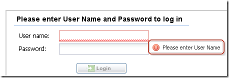
Some touches of finesse, looking cool:

Enter our credentials(I’ve used the default user vyatta, the password is the same for a specific user, either you use it to login from the CLI or GUI), and we’re in:
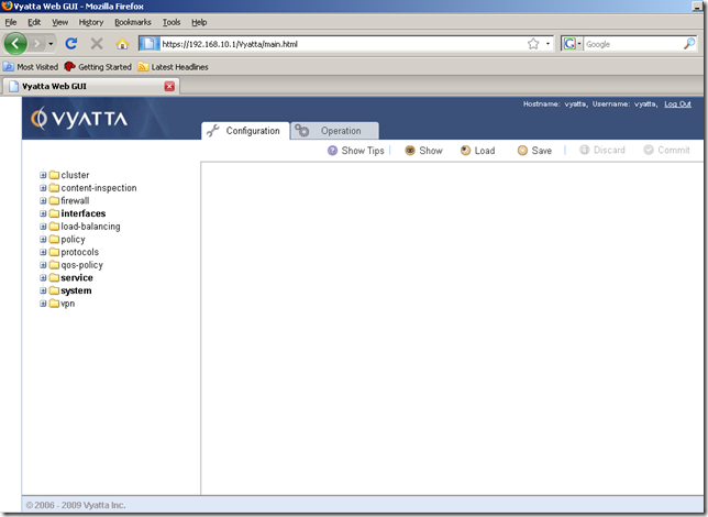
There is no initial configuration wizard or so. In fact there are no wizards at all. However sometimes, when configuring certain options and following certain steps, we may have a feeling of using a wizard.
One may think that if he closes the browser, it will be automatically logged out. This is not the case with this version of the GUI, as if you launch again the browser and navigate to Vyatta’s OFR machine address, you’ll be logged in. So do not forget to click logout.
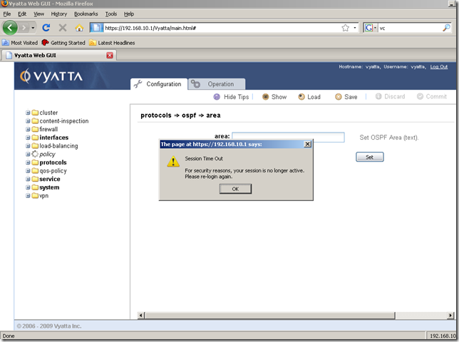
There is a default 30 minute idle time-out for a session(the time-out did not appear to automatically kick me out to the login page, it happened so when I’ve clicked the OK button, just the session was cut):
And bellow is the intuitive thing I was talking before, it’s right here from the first screen after login. The page is very clean using a simple, easy to use layout.
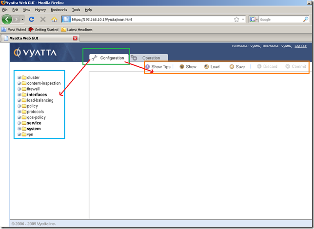
We have two main functional tabs in the Header Area, the Configuration and Operation tabs:
- the Configuration tab: the Navigation Area on the left and the Command Buttons Area on the top-right. From the Navigation Area we can configure the Vyatta OFR machine, configure the interfaces, the firewall, the routing protocols, the VPN, the web proxy etc. From the Command Buttons Area we can view the current configuration(the Show button), Discard or Commit the new configuration lines we’ve added(bellow the two buttons are grayed as there isn’t anything to be committed or discarded), Save the current configuration or Load another saved configuration. Also there are some available tips, we can display them using the Show Tips command button, or hide them using the Hide Tips command button in case we don’t need them anymore.
And this is not all in respect with intuitive thing, as we can notice, some configuration nodes from the Navigation Area are bolded. This little detail can help a lot, as one may login and immediately notice what current options are currently configured and committed on the Vyatta machine. For example, on this Vyatta some settings were configured and committed for: the interfaces, the system and the service. The firewall or the load-balancing settings were yet to be configured.
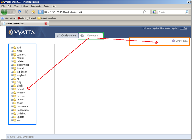
- the Operation tab: the Navigation Area on the left and the Command Buttons Area on the top-right. From the Navigation Area we can run various commands like ping, tracert, disconnect an interface, reboot the machine, view the ARP table, delete ARP entries, clear DHCP leases, run init-floppy, generate a VPN RSA key, run a debug command for various protocols, turn off the debugging, run the show commands to display the NAT rules, NAT statistics, web proxy, firewall rules, IPsec SAs, the interfaces, view various details about the hardware of this machine, like the CPU, the memory, etc. From the Command Buttons Area we can view the available tips using the Show Tips command button, or hide them using the Hide Tips command button in case we don’t need them anymore.
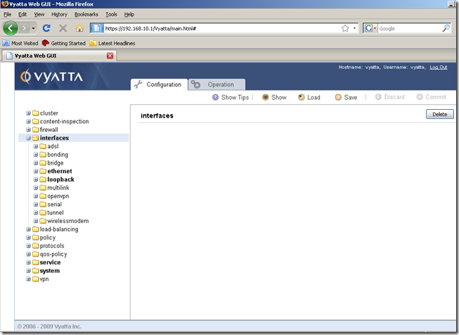
If we click the interfaces node from the Navigation Area of the Configuration tab, again very nicely we can easily spot what interfaces are currently configured and committed:
If we want to configure a specific interface, we will specify its name(say eth1) and click the Set button(eth1, like eth0 was already configured in the bellow screen shot(I’ve enable the Tips too):
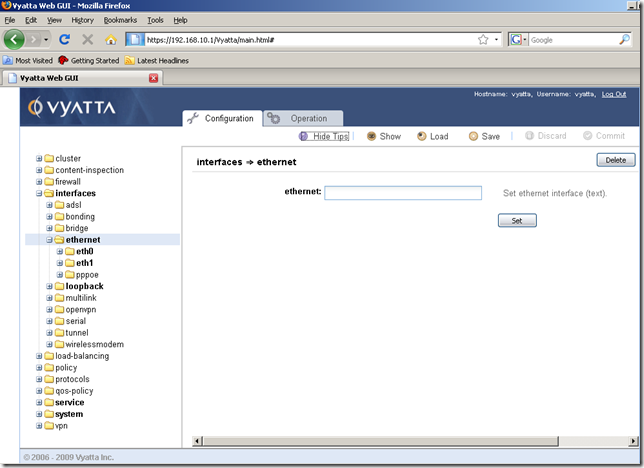
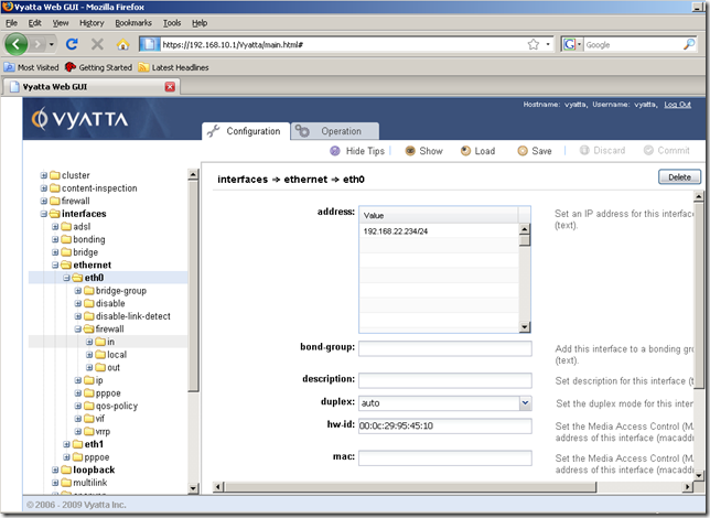
Note also the specific settings for eth0 ordered hierarchically(the Tips are on here too):
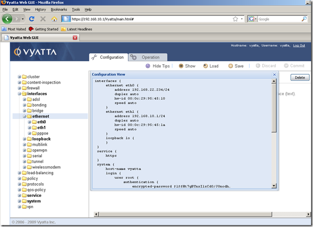
And the Show button, for viewing the configuration. But the Show button currently displays the entire configuration of this machine, one may think that since he is in a specific node or sub-node, it will display only the configuration for this.
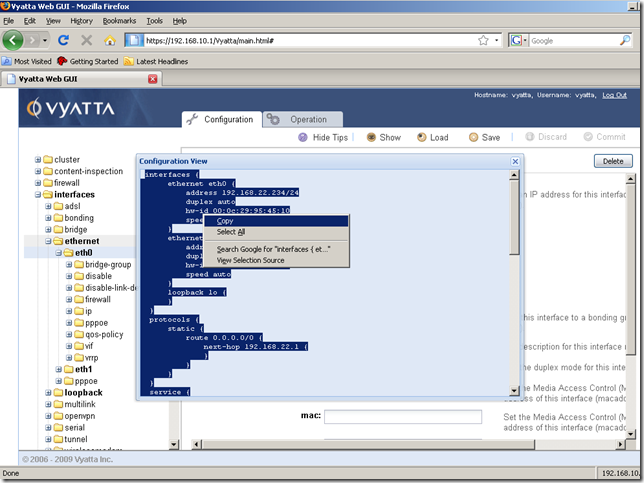
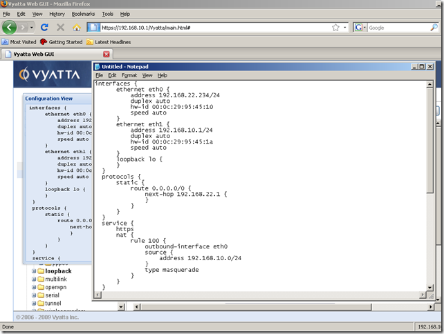
We can easily copy and paste the configuration from the Configuration View window:
Also we can copy and paste from the Input/Output area(for example the IP addresses of the DNS servers are consecutive, say the address of the first DNS server is .1 and the address of the second DNS server is .2, so a quick copy+paste+replace 1 with 2 speeds the configuration process):
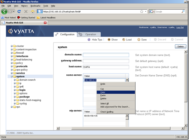
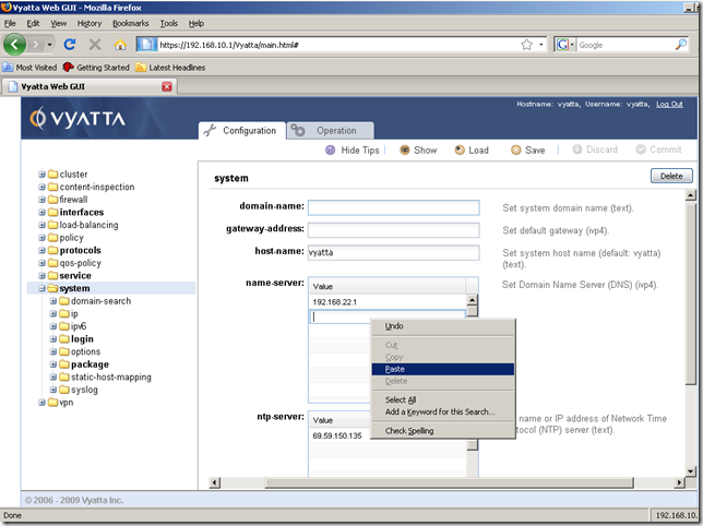
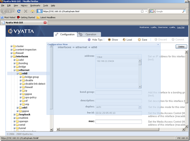
Another touch of finesse, if we move the Configuration View window(which appears when we click the Show button), this window becomes transparent while we’re moving it:
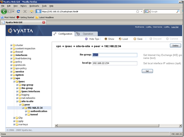
And here is one place where things become not so intuitive, let’s move a little bit from the interfaces node. Say we’ve just created and committed an IPsec s2s VPN, and we want to quickly double-check the configuration entered. The problem is we have to step-by-step click through the sub-nodes, and there are many of them:
The only way(that I’ve noticed) to quickly view what we’ve just configured without moving from the Configuration tab, is to use the Show command button, and scroll through the entire configuration of this machine:
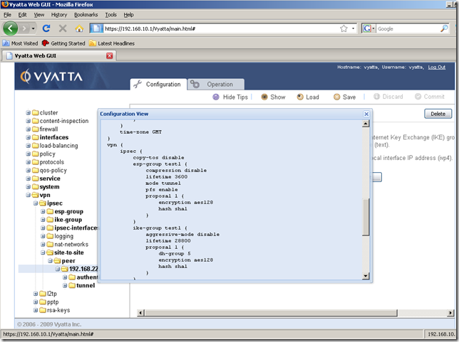
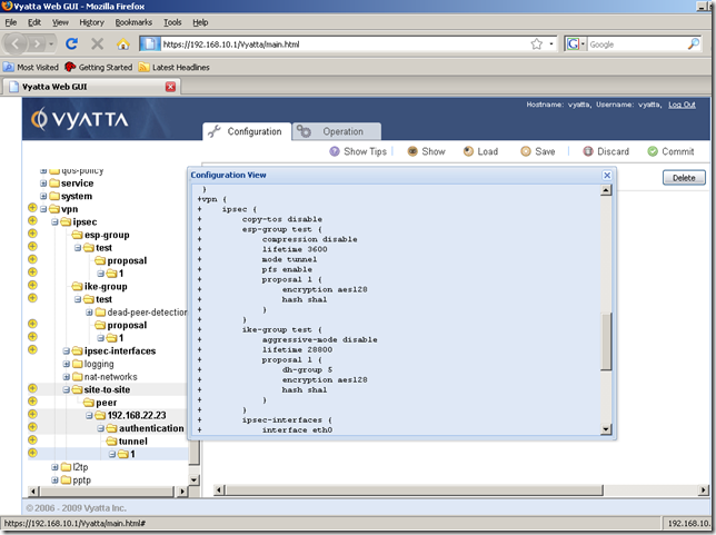
This will also be true if we have not committed yet the configuration of the new s2s, the lines with the “+” sign indicates the lines that will be added once we hit Commit:
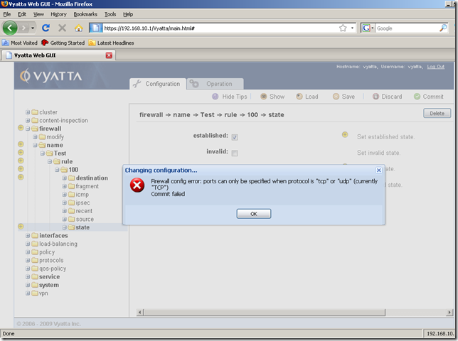
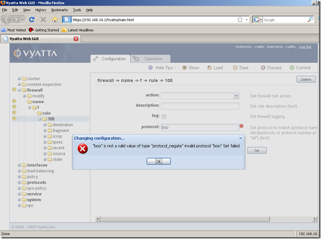
Semi-intuitive error, see bellow, for new users when hitting the Commit button. The error tells us what we did wrong, but does not show us where the “guilty” setting is. One’s eye might not catch the error, it should be “tcp” instead of “TCP”. The Tips are not very clear either, it may have contained “tcp” or “udp” as a quick example along with “all”. There isn’t yet a drop-down menu for the protocols available by name. Actually this is a thing that you may observe: sometimes there are drop-down menus and sometimes there aren’t drop down menus where one may expect/need them.
Obviously this error is very-intuitive for the users familiar with Vyatta.
Also note that when we click the Set button, the GUI does not complain about the error, the error appears upon hitting Commit:
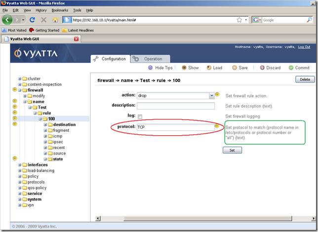
However it does complain when I enter some junk into that field and hit the Set button:
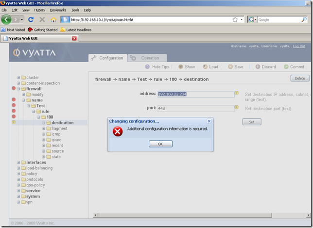
Another error, some red dots appear now when we hit the Commit button and are they very useful, pointing us to the “guilty” setting:
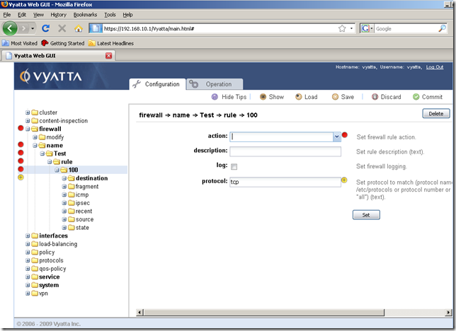
So, we’ve seen some yellow and red dots, what’s up with them ?
They are Navigational Aids.
When we’ve added some configuration lines, and we did not yet committed these settings, the yellow dots will appear, with a “+” sign telling us what we’ve added:
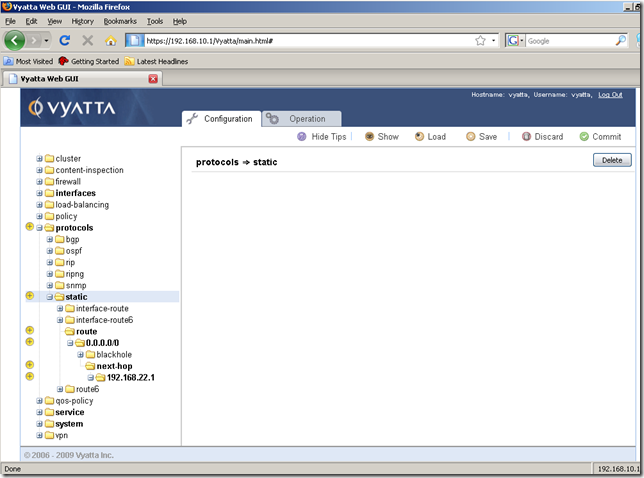
Also there is a “clear” yellow dot, without any sign on it. For example the service node, already includes the configured and committed https service. If we add a new service, say nat, the yellow dots with the “+” sign tell us that we’ve added some new configuration without committing it, and the “clear” yellow dot tells us that we’ve modified the service node, thus it indicates us a modification within the service node.
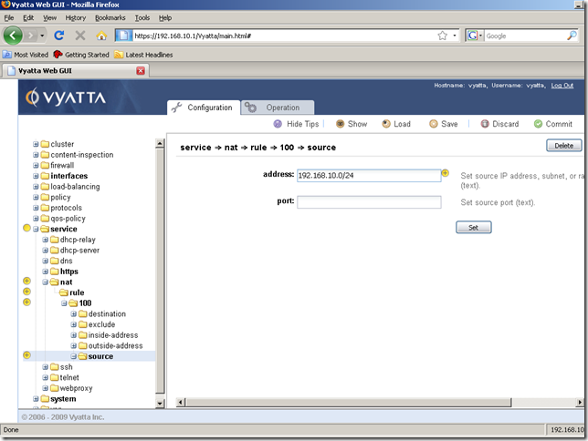
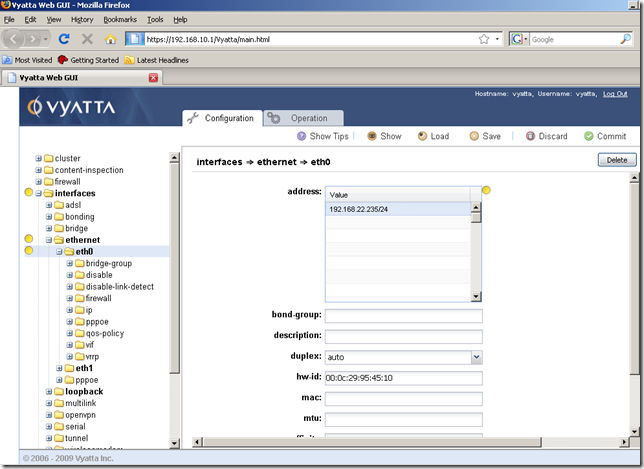
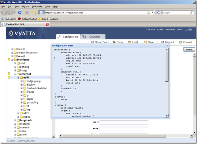
Or for example I’ve modified the IP address from the eth0 interface, so the “clear” yellow dots will appear. Note that if we now click the Show configuration command, within the Configuration View window the “-” sign will indicate the line which will be deleted, and the “+” sign the new line to be added. Very simple.
The yellow dots with the “-” sign indicates an uncommitted deletion. Bellow I’ve deleted the nat service, but I’ve not committed this modification yet.
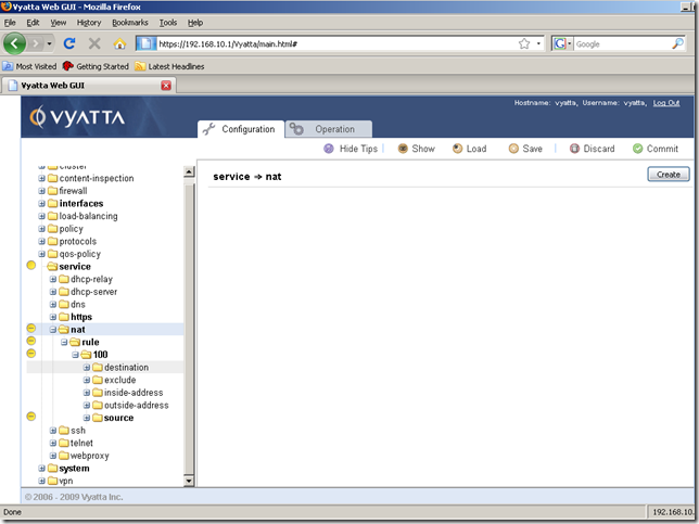
We already saw what the red dots do.
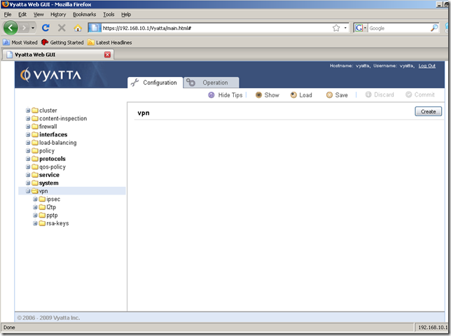
OpenVPN cannot be configured for the moment from the vpn node:
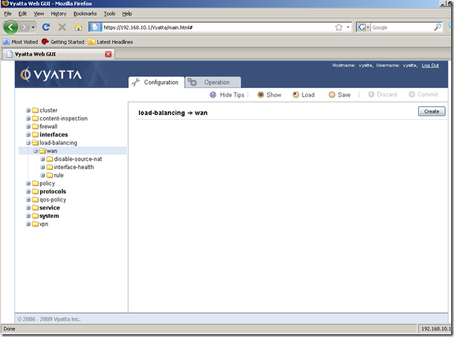
The load-balancing node:
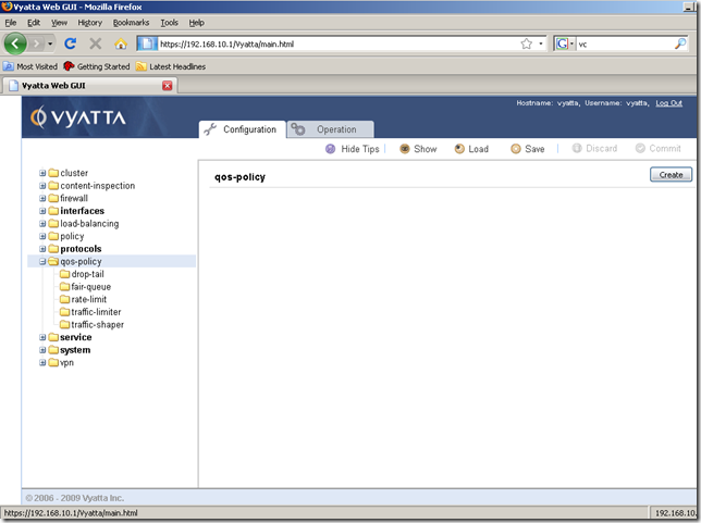
The qos-policy node:
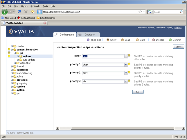
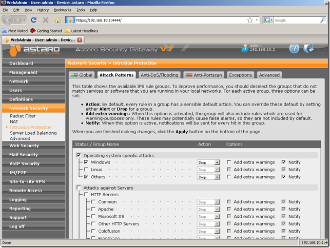
The content-inspection node, ips sub-node, it appear that the “minimalist style” in respect with IPS management that has “touched” Astaro lately(version 7 of their UTM), has also “touched” even “harder” Vyatta, I think I’m about to enable some IPS rules bellow, not sure what though: ;)
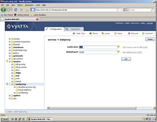
The webproxy node:
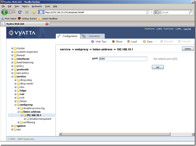
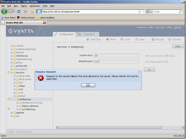
I’ve enabled the url-filtering to block a web site. When I’ve attempted to delete the url-filtering sub-node, the GUI came out with the bellow error. I’ve refreshed the browser, and the url-filtering sub-node appeared to have been deleted.
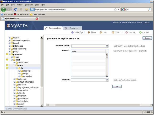
We can manage the routing protocols from the GUI, for example OSPF, from the protocols node:
Let’s move away now from the Configuration tab to the Operation tab.
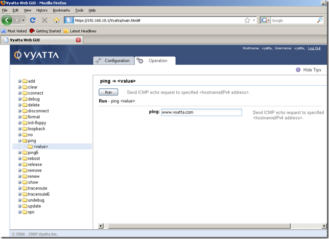
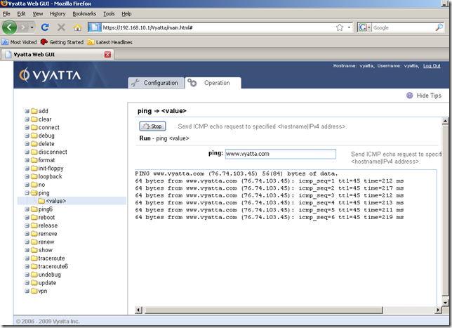
And test connectivity and name resolution from this Vyatta machine, by using the ping command with a DNS name. The reply messages are displayed in bunches of three at a time:
Display the configuration:
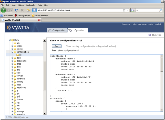
There isn’t much configured on this machine yet, but just to show you the versatility and the huge quantity of information we can get using the Navigation area from the Operation tab, I will display some info about the interfaces of this machine.
From the show node, the interfaces sub-node, let’s run a show interfaces command, which will display the interfaces of this machine and their status:
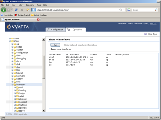
But we may want to quickly view only the Ethernet interfaces:
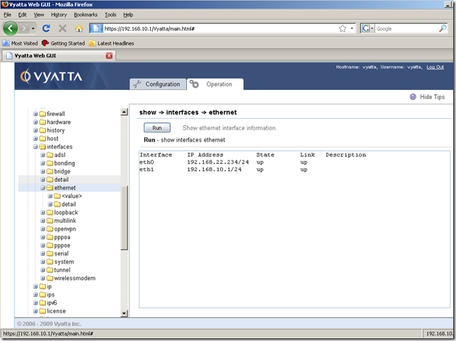
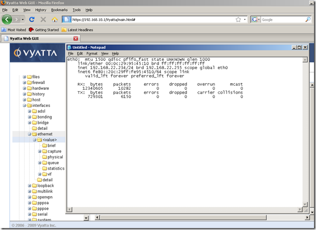
Or just some info about a specific Ethernet interface:
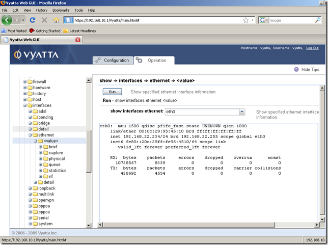
An important aspect, we can copy and paste the information we want from the Input/Output area:
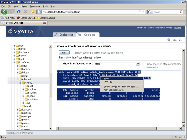
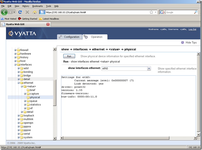
Or we may need to display some physical device information about a specific Ethernet interface:
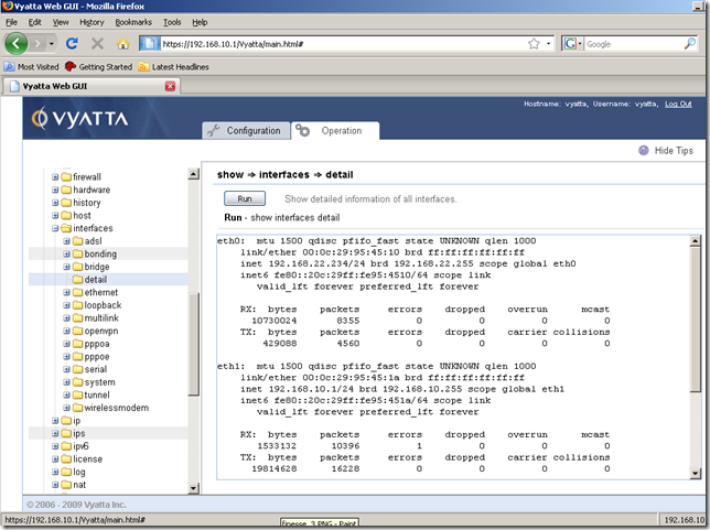
Maybe we want more details about the interfaces from this machine:
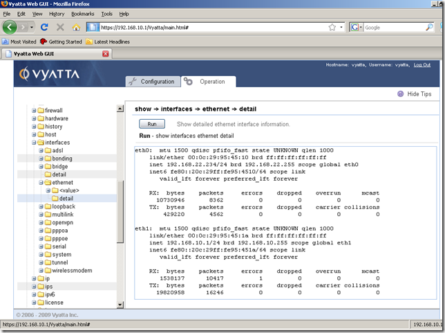
Or details only about Ethernet interfaces:
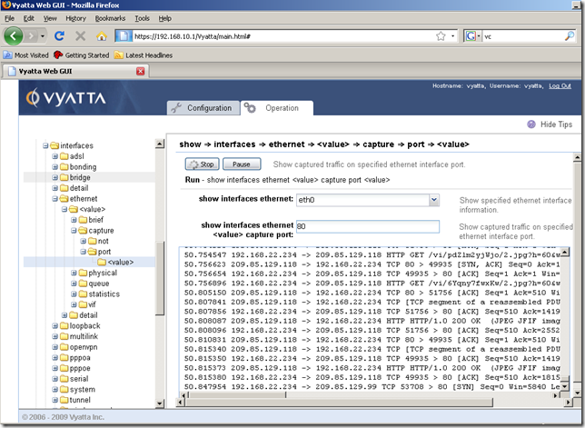
And icing on the cake, we can live capture the traffic on a specific interface(although for the moment the Input/Output area is a little slow to display the captured traffic):
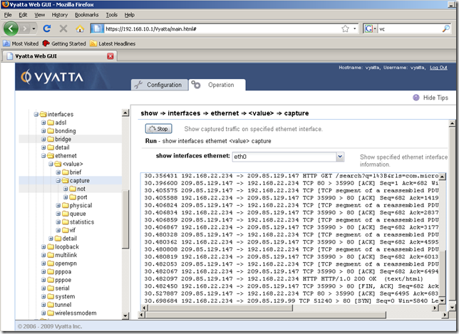
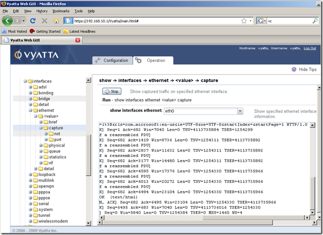
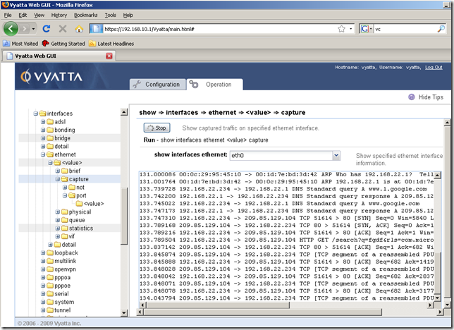
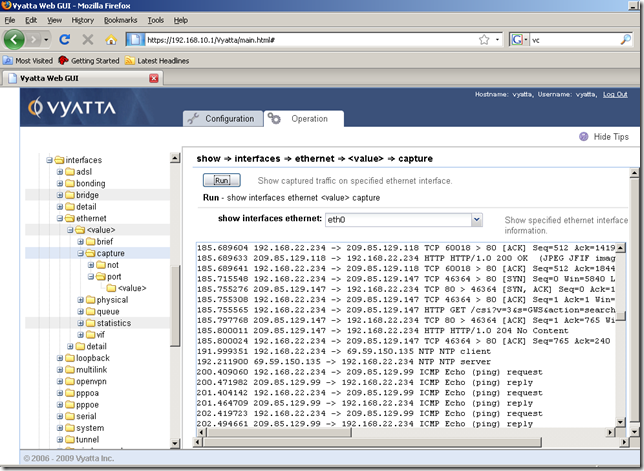
We can actually filter the traffic we want to capture on a specific interface:
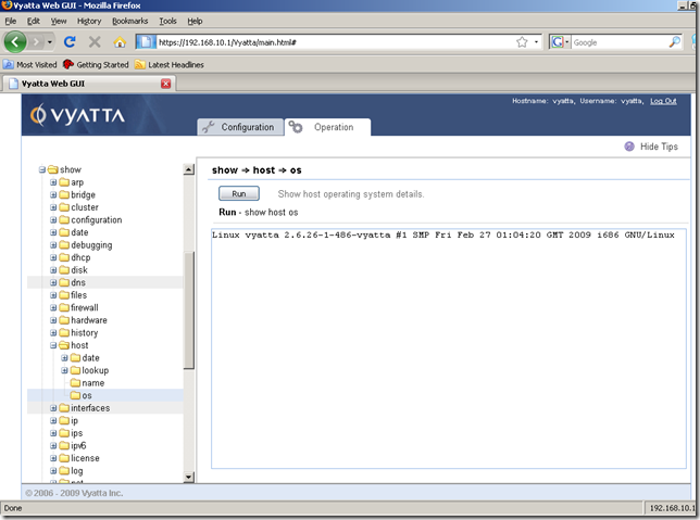
Display the host operating system details:
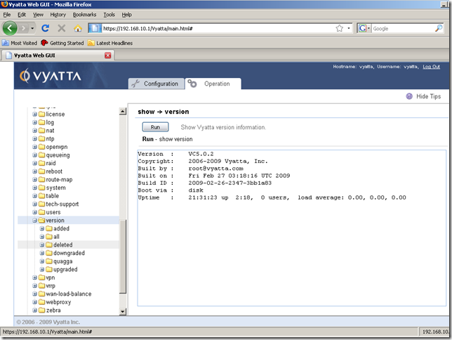
Or the version of the Vyatta OFR:
Another show command, let’s view the current IP routes:
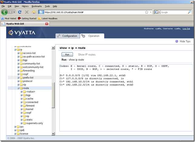
Or just the static routes:
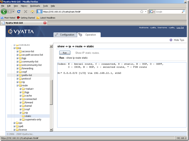
Let’s analyze a little bit the info for NAT rules.
We can quickly display the currently configured NAT rules:
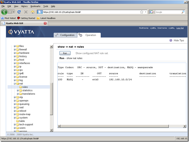
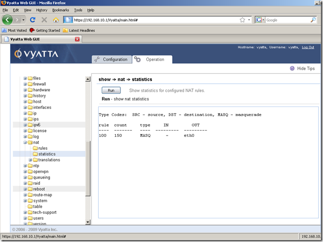
The statistics for these NAT rules:
View the active NAT translations, brief view:
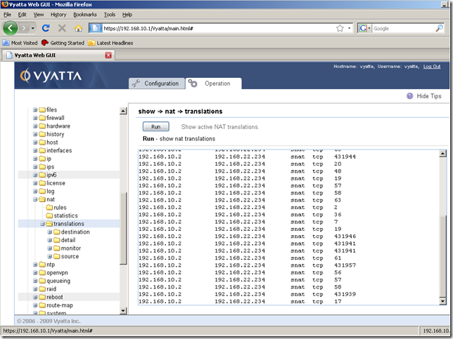
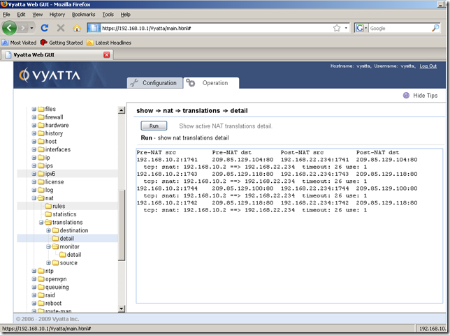
View the active NAT translations, detail view:
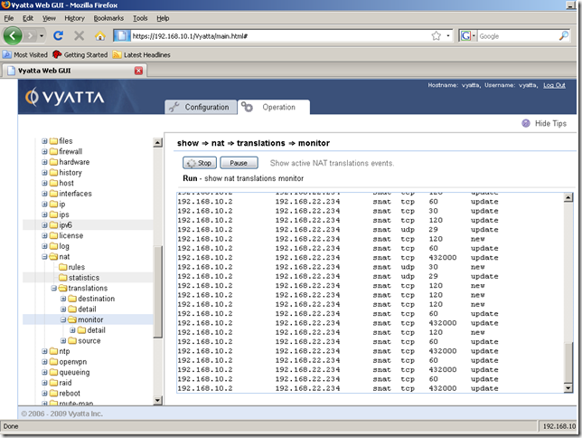
Live monitor the active NAT translations, brief view:
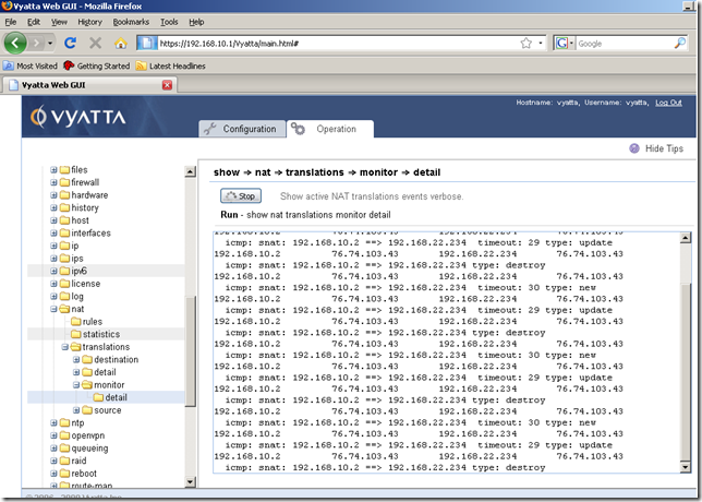
Live monitor the active NAT translations, detail view:
In part two we will configure something using the GUI. Say add a NAT rule and a default route so that a host behind this Vyatta to access the Internet. And setup some firewall rules.
Just to feel the GUI a little bit.